

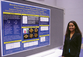
Engineers routinely optimize process designs; poster designs need optimization, too.
In the August 2010 issue of Chemical Engineering Progress (CEP) magazine, L. P. Driskill, a professor of English and management communications at Rice University, provides an excellent "how-to" guide for engineers and students who need to prepare posters that capture and hold viewers' attention and effectively explaining their subject matter -- whether it be research, a technical process, or a job candidate.
Here are some of the recommendations contained in the article. Log-in to the August issue of CEP for the full story.
Trigger quick judgments about your project's purpose and significance
- Draw attention to the title with large type, color contrasts, and a visually defined title area.
- Reword your title to indicate the purpose and significance of your work.
- Use terms specific enough to permit audiences to judge their interest but not so specialized that few will understand the title. Avoid low-content general terms such as "A Study of (General Topic)."
Increase accessibility so viewers can identify the poster's topic, organization, and how long it will take to view it
- Arrange sections to suggest a visual argument about your project. The layout should suggest the logical relationships among the sections.
- Signal a path for the viewers' eyes.
- Choose color contrasts to emphasize the visual argument and draw attention to important parts, such as major headings and key diagrams.
Make it easy for readers to understand your argument
- Make the most important points about the project obvious and legible in the headings.
- Deliver your message with high-specificity major headings (except for references, acknowledgements, etc.).
- Summarize your message legibly; don't print a journal abstract in tiny point size. Make sentences in the summary lively; minimize passive voice.
Emphasize the poster's professional value to the viewer
- In the abstract or summary, set your project in the context of other work.
- Include references and future work sections.
- Provide detailed contact information.

Increase legibility so readers will enjoy your poster's visual appeal
- Use less text to improve the reader's first-glance impression of the benefit to be gained by reading relative to the time required.
- Slim down fat text into bullet points and phrases (few sentences).
- Maintain legibility by choosing text and background colors that contrast sharply.
- Choose a san serif font that is easy to read from a distance, such as Arial, Helvetica, or Verdana, whose characters have nearly uniform shaft width and no "tails" or "feet".
- Frame text with blank space; don't extend text to the edge of an area.
The August 2010 issue of CEP is now available online. AIChE members receive access to CEP, including a searchable archive of issues dating back to 2001, online at http://www.aiche.org/cep.